September 21, 2024
Switch to JSON Plotly to customize charts more
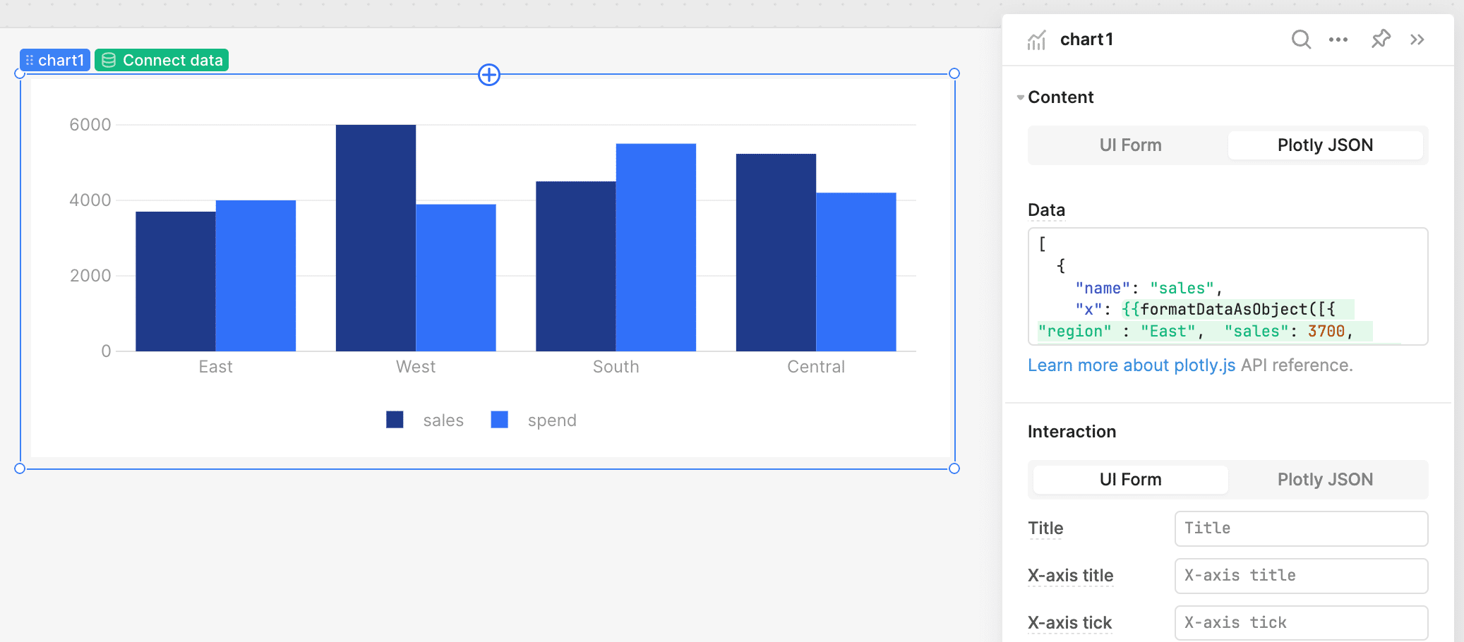
Retool uses Plotly for its native charts, which is a powerful JSON-based JavaScript library that allows many custom configurations. However, Retool’s UI version of Plotly provides only a subset of the available settings.
One common limitation is the lack of an option to make bar values always visible, by default, these values are hidden in tooltips.
While tooltips are useful, it’s often better to display the values directly on the chart, especially when you need to print or export charts to PDF. Here's how to do it.
To add visible labels in a Retool Plotly chart, you need to switch the chart configuration mode from UI to JSON. Here's the step-by-step process:
Once in JSON mode, add the following lines to display the values as labels on the bars:
"textposition": "auto",
"texttemplate": "%{y}",
With this configuration, the values will be positioned over the bar, and Plotly will automatically adjust the position based on the bar size. The "textposition": "auto" property allows Plotly to decide the optimal label position. If needed, you can fine-tune the position using options like outside, inside, auto, top,left, bottom, or middle.
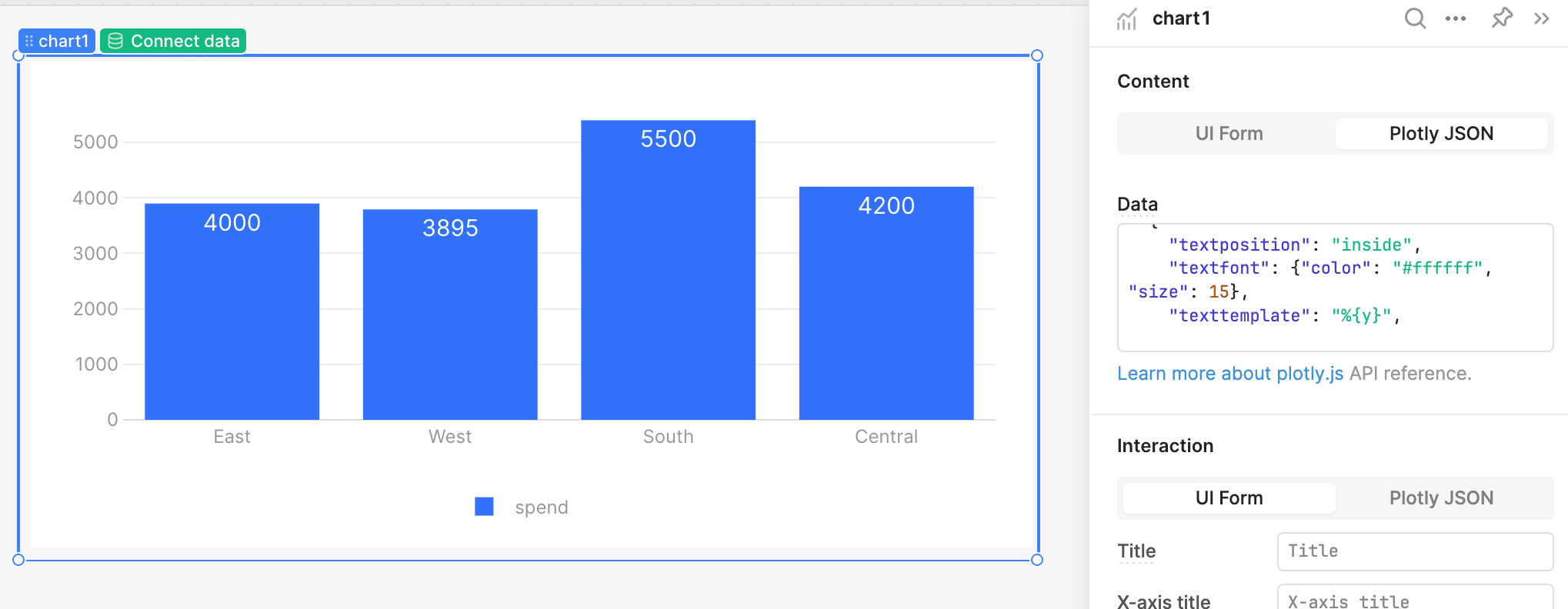
By default, the label color is gray, which works well in most cases. However, if you want to customize it further, you can specify the font color and size:
"textfont": {"color": "#ffffff", "size": 20},
This snippet sets the text color to white and the font size to 20, making it more prominent on dark backgrounds.
If you need to display custom text rather than the actual value, you can use the "text" property to override it:
"text": "Custom label",
This feature is handy when you want to show calculated values or additional context next to each bar.
While Retool's UI limits some of the configurations available in Plotly, switching to JSON mode unlocks a wide range of customization options. Adding visible labels is just one of the many ways you can enhance your charts to be more useful for presentation or reporting. With a few tweaks in the JSON configuration, you can make your data more accessible and visually appealing.
We help ambitious companies ride the change